

[EN]
Begin
Year: 2023
Category: Drink
Context
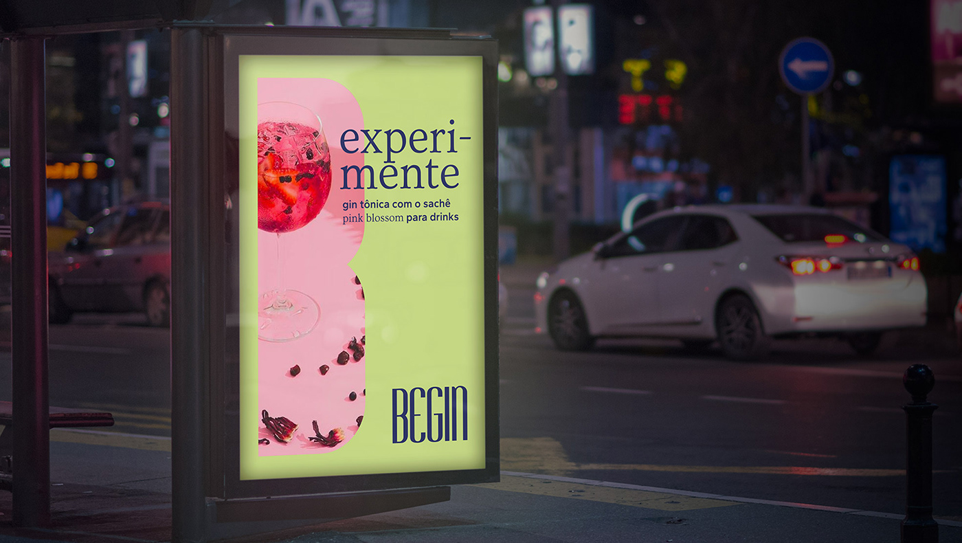
Begin is a company focused on experiences in the world of drinks. The products are delicious, and the releases usually have a touch of innovation. The guiding concept for the brand's labels is the word "explosion": flavors, senses, originality, colors, and textures. 100% exclusive illustrations complete the labels and tell the brand's story in an artistic manner.
What we did in this project
Visual identity and packaging design.
Development
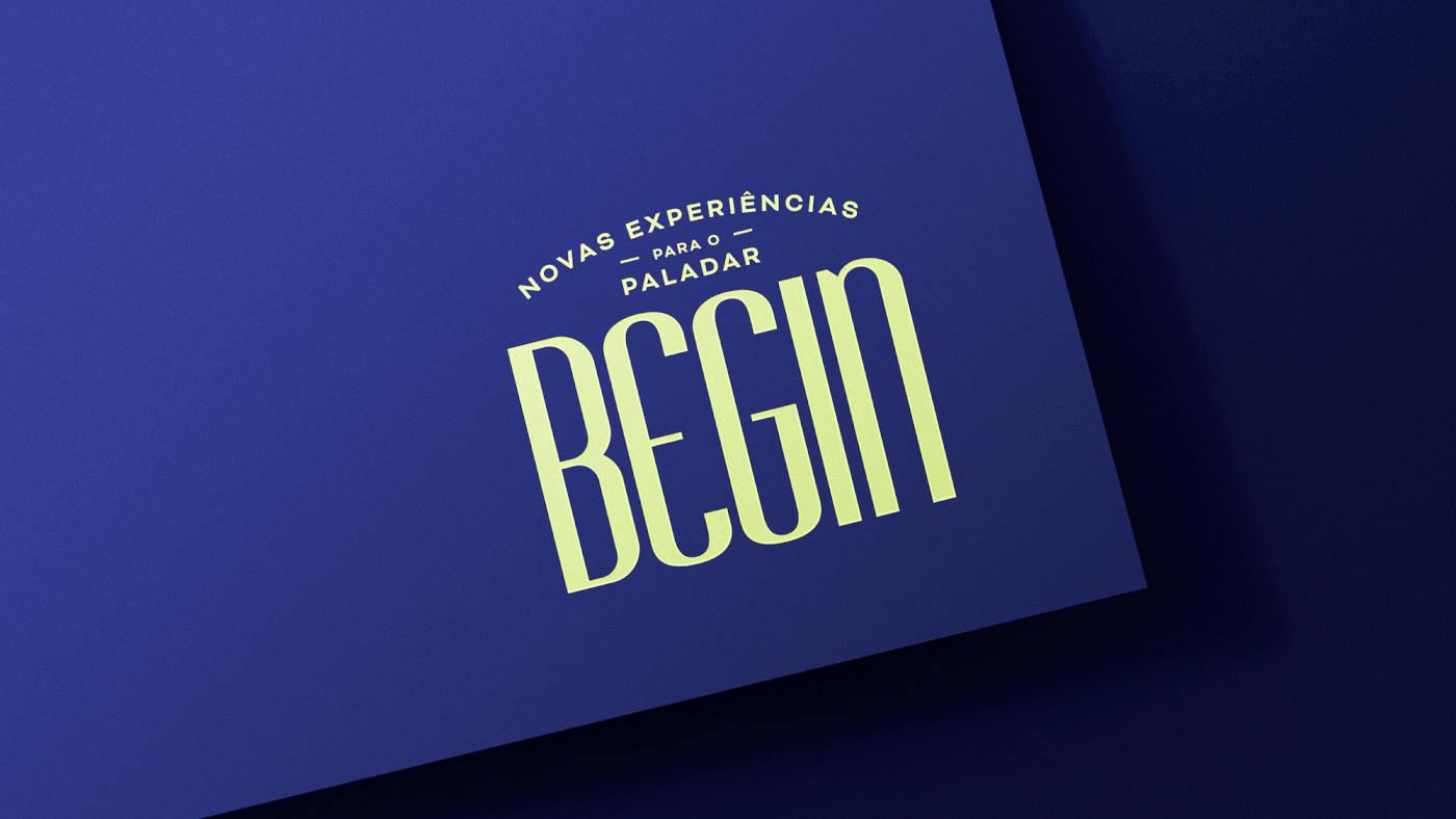
The initial phase of crafting the new brand identity involved identifying key touchpoints. It became apparent that the brand needed to enhance its presence in areas with limited width and ample height, particularly on the packaging of its products, such as cans and bottles. The previous brand lacked distinction on the packaging, resulting in an absence of crucial visibility at the point of sale.
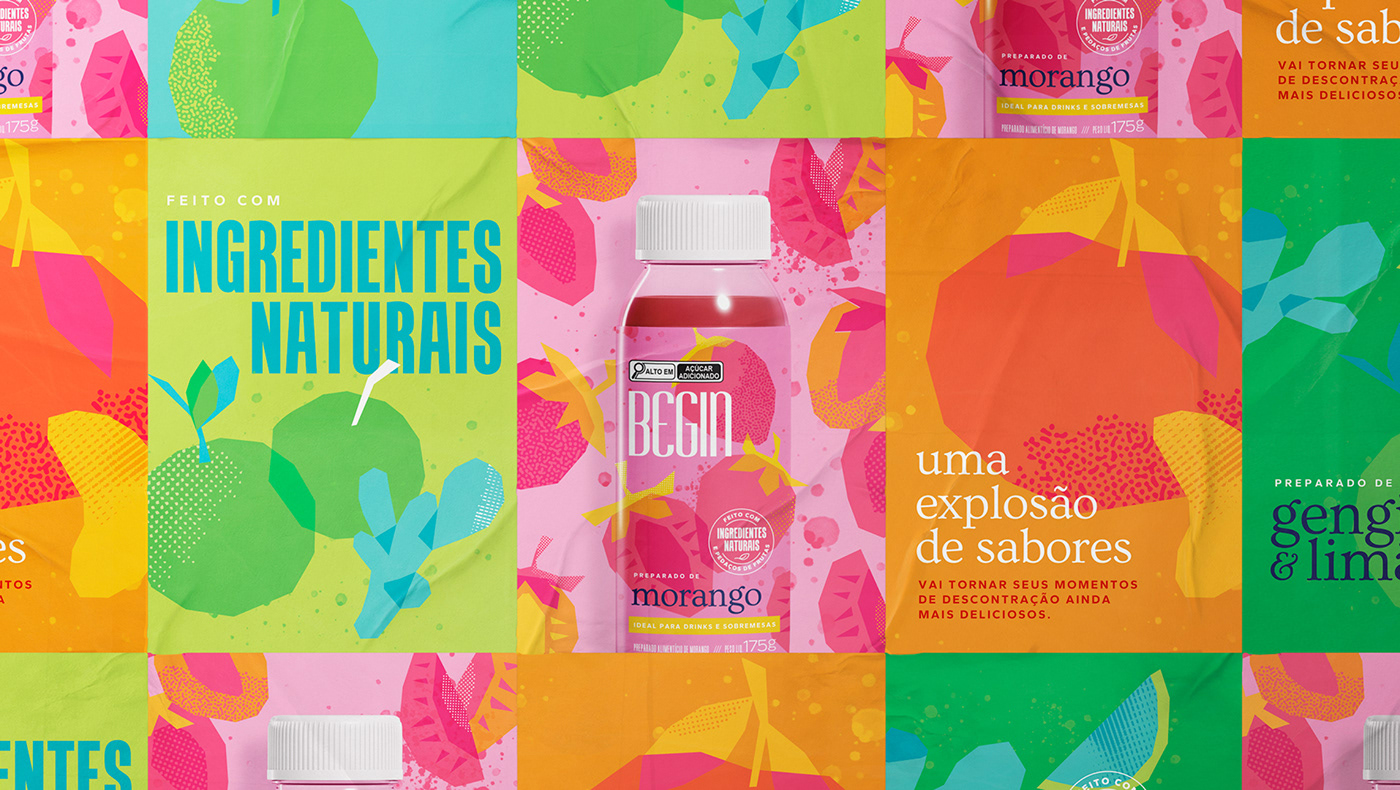
This realization guided us through the development of the new brand, using condensed letters, infusing it with a touch of the innovative characteristic of the ideas of partners João and Julia. The design of the packaging was centered around a theme: the "explosion”. Intense flavors were highlighted with a playful touch, incorporating exclusive illustrations and a vibrant color palette designed to captivate attention and generate curiosity for these relatively new products in the market.
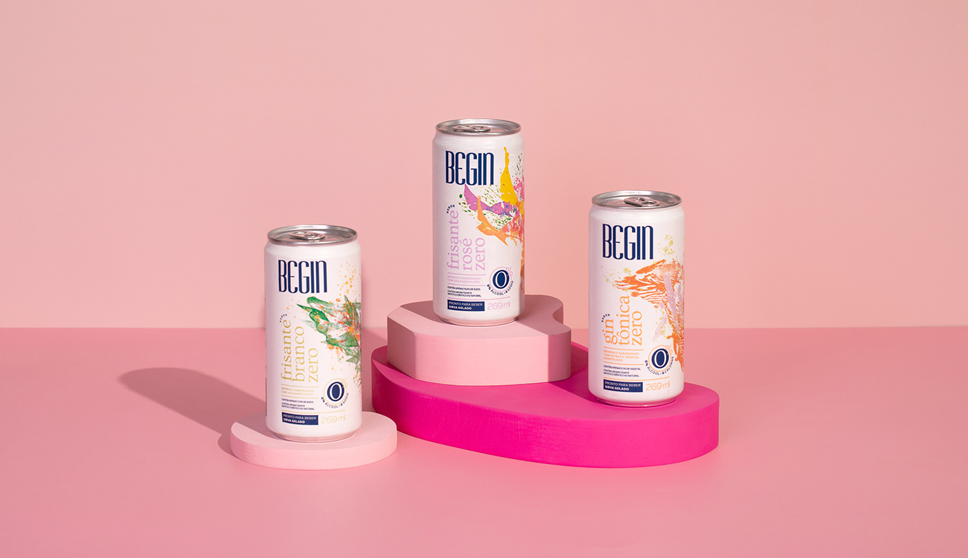
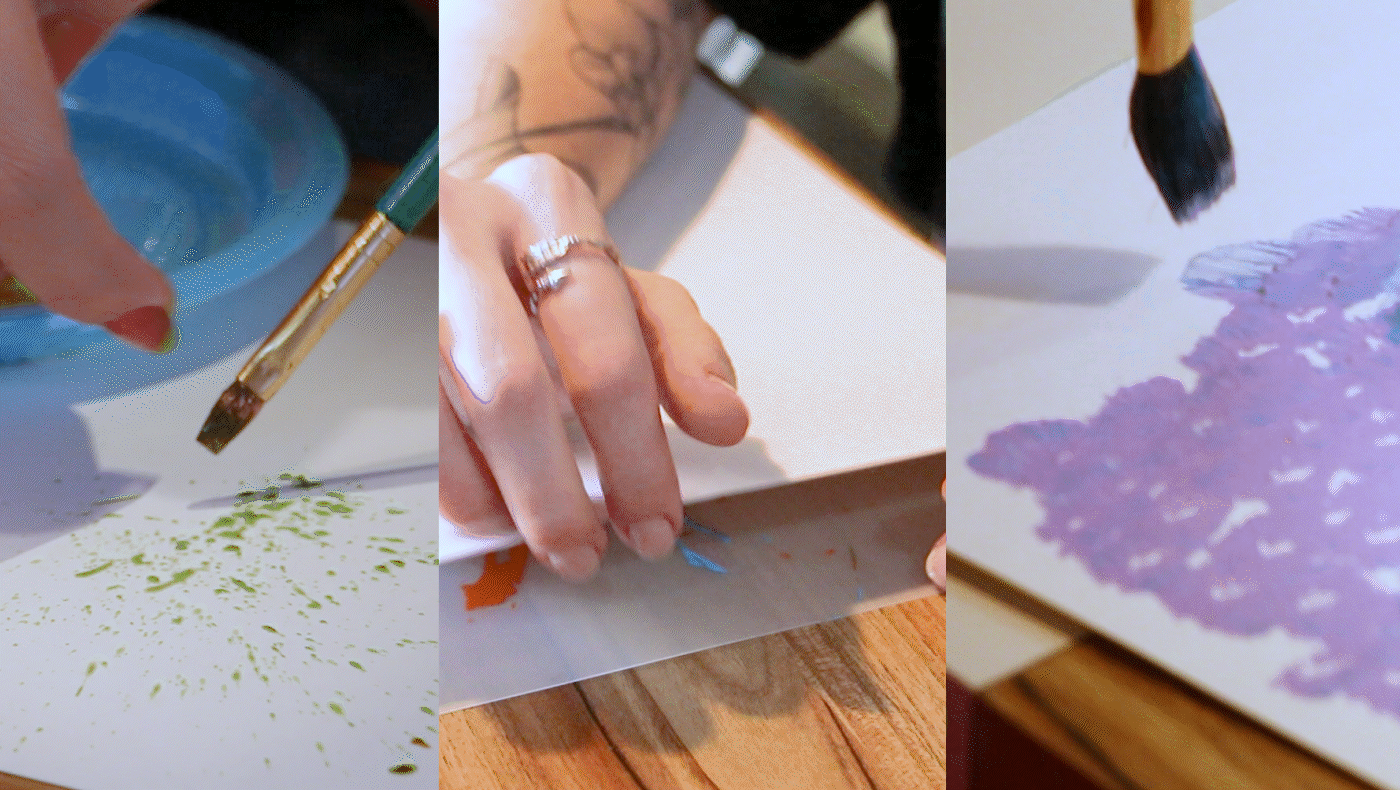
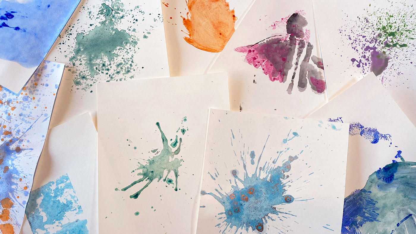
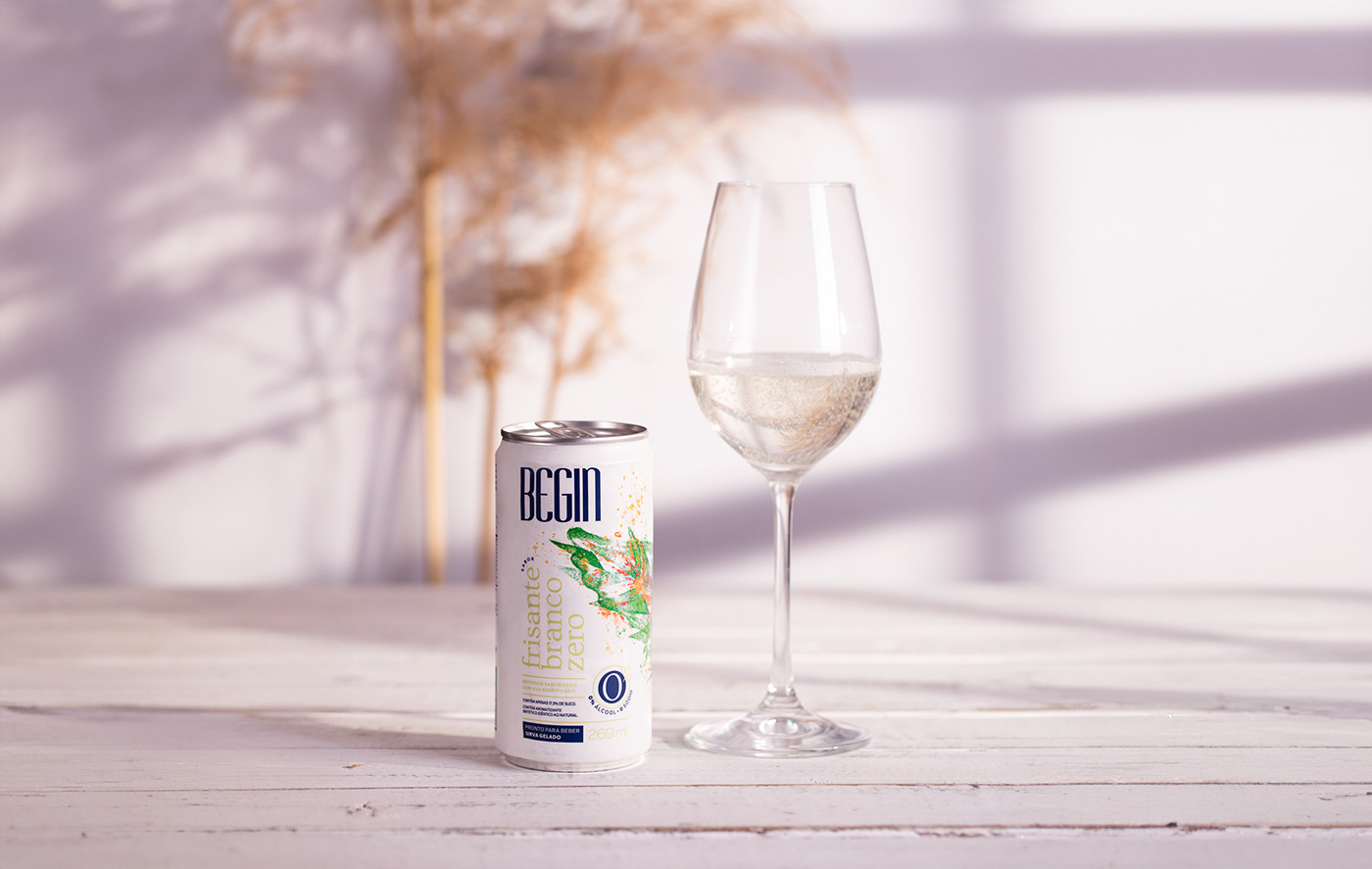
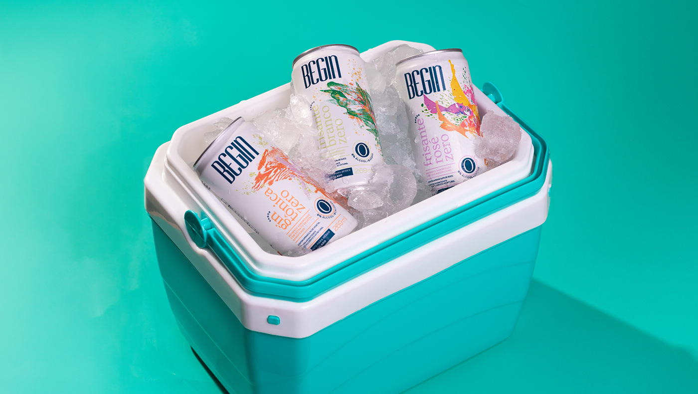
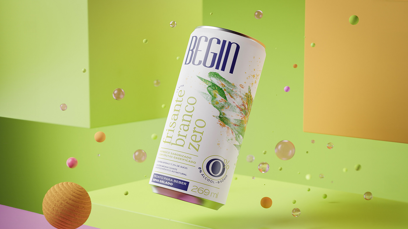
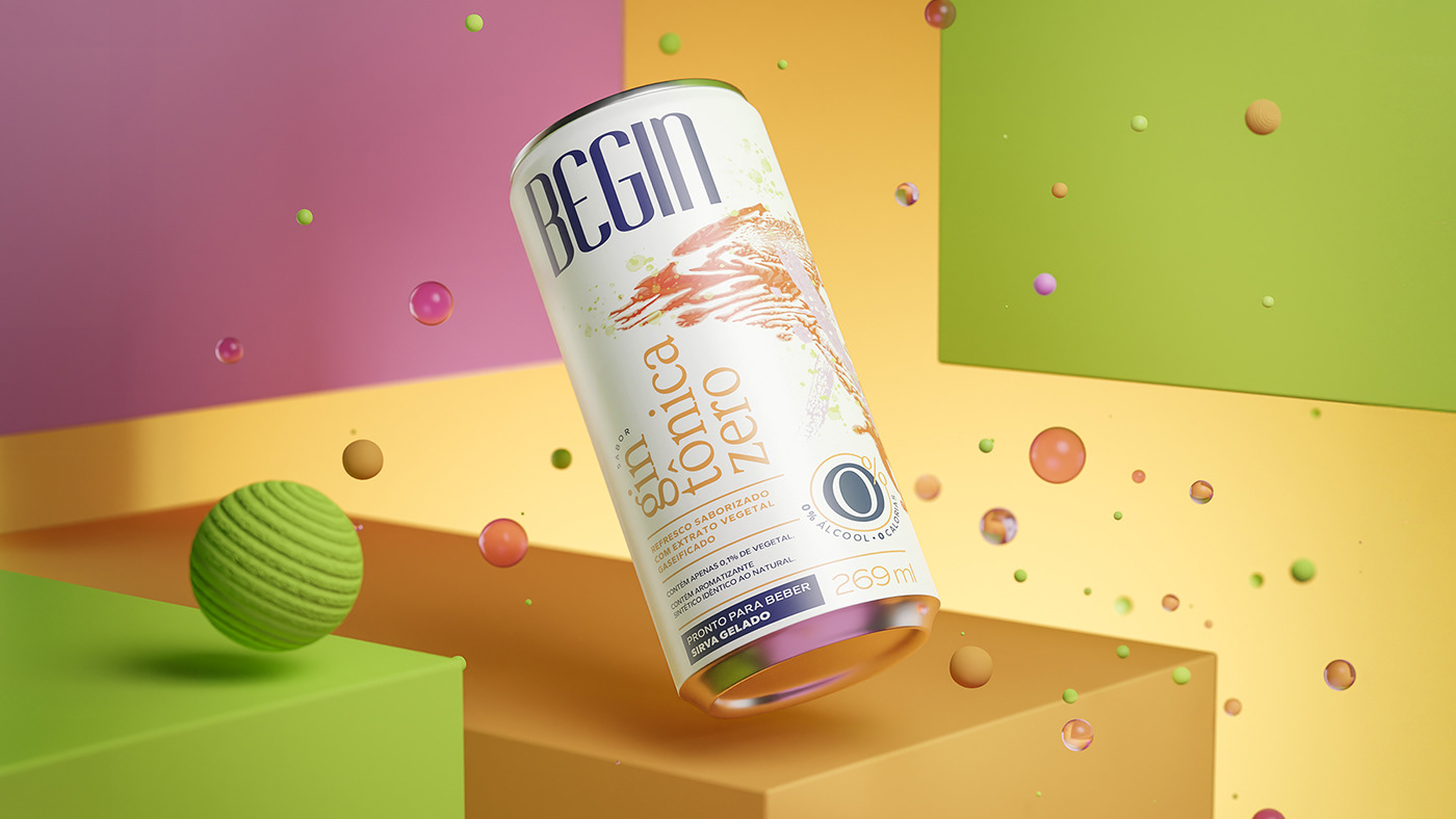
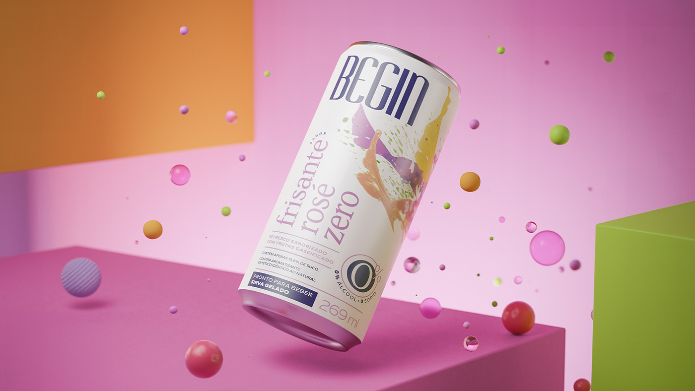
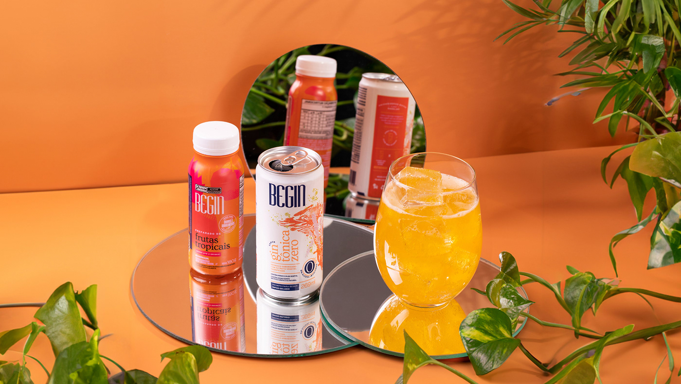
The first products we designed were the cans in the Zero Alcohol Line, which featured graphics created through an experimental workshop involving paints, papers, brushes, sponges, and water. The outcome involved explosions with wings, generating abstract textured forms adding an artistic touch to the products. The concept centers on blending the minimalism of white with the colors and textures of the graphics, ensuring the products offer the convenience of independent consumption, directly from the can, at any time of day.
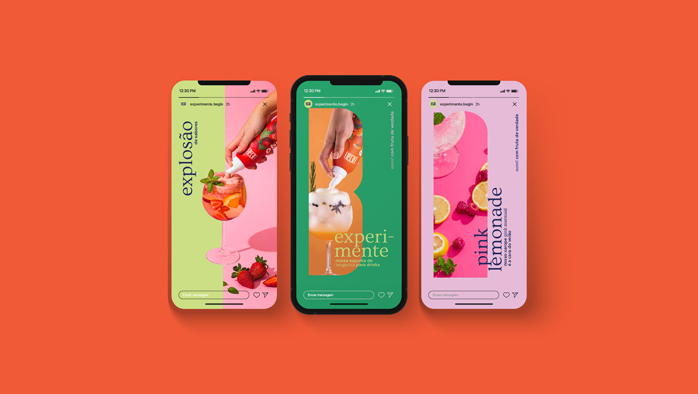
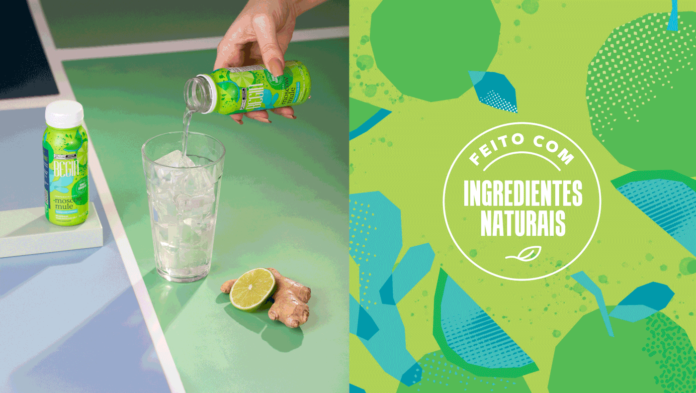
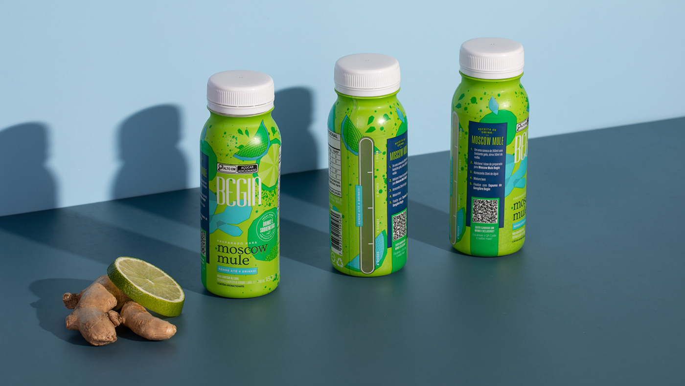
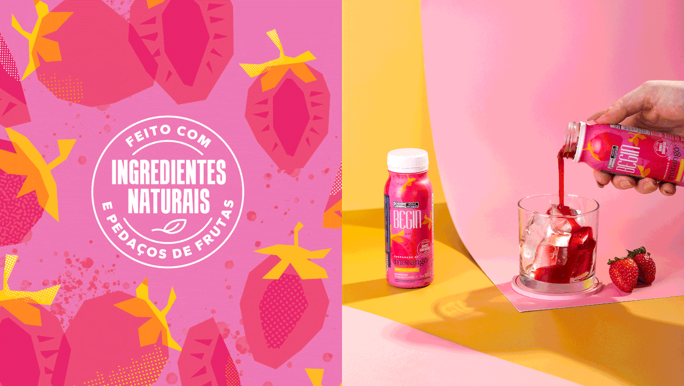
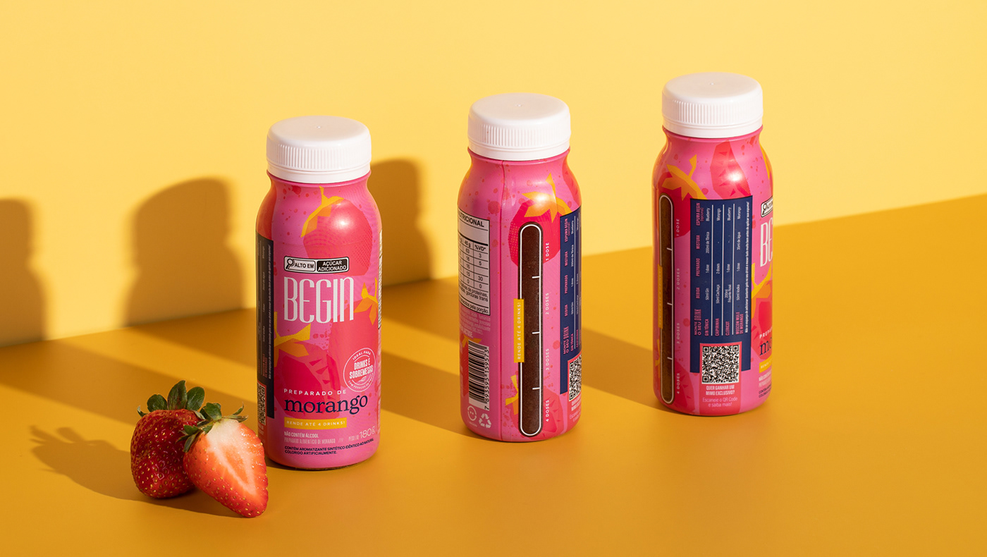
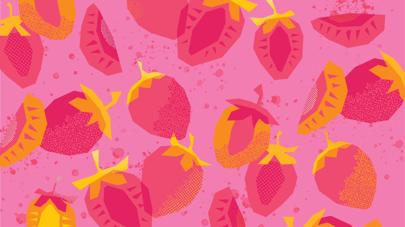
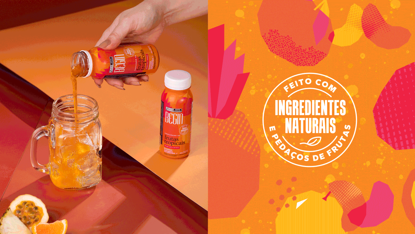
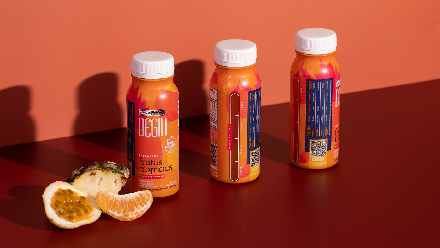
We were also invited to develop labels for the Fruit Blends, products made with real fruits that add a special touch and allow imagination for creating various flavorful and easy-to-prepare drinks. The bold background colors serve to accentuate the illustrations of the fruits, highlighting the ingredients of each blend and emphasizing their intense, non-traditional flavors. Additionally, a transparent measuring guide was incorporated into the layout, aiding consumers in precisely measuring quantities for 1, 2, 3, or 4 drinks.
[PT BR]
Begin
Ano: 2023
Categoria: Bebidas
Contexto
A Begin é uma empresa focada em experiências no universo de drinks. Os produtos são saborosos e os lançamentos possuem um quê de inovação. O fio condutor para os rótulos da marca é a palavra explosão: sabores, sentidos, novidades, cores e texturas. Ilustrações 100% exclusivas completam os rótulos e contam a história da marca de maneira artística.
O que fizemos
Identidade visual e design de embalagem.
Desenvolvimento
Nosso objetivo foi destacar os produtos no PDV e, por serem produtos relativamente novos no mercado, fazer com que as pessoas tenham vontade de descobrir novos sabores.
A temática explosão permeia toda a direção gráfica da marca - evidenciando os sabores das frutas que são intensos - sempre com um toque divertido, ilustração exclusiva e combinação de cores fortes.
O primeiro produto que desenvolvemos, as latas da Linha Zero Álcool, conta com grafismos desenvolvidos por meio de um workshop experimental com tintas, papéis, pincéis, esponjas e água. Como resultado temos explosões com asas que geram formas texturizadas abstratas e que dão um toque artístico para os produtos. A ideia é mesclar o minimalismo do branco com as cores e texturas dos grafismos, conferindo aos produtos a praticidade de drinks que podem ser consumidos sem acessórios, ou seja, na própria lata e a qualquer hora do dia.
Em seguida, também fomos convidados a desenvolver os rótulos para os Preparados de Frutas, produtos inovadores, feitos com frutas de verdade, que dão um toque especial e permitem o uso da imaginação para a criação dos mais diversos e saborosos drinks. As cores fortes do fundo trazem o destaque esperado e as ilustrações das frutas realçam os ingredientes de cada preparado, evidenciando seus sabores intensos, que fogem do trivial. Além disso, foi adicionado no layout um dosador com base transparente para que as pessoas saibam exatamente qual a quantidade indicada para 1, 2, 3 ou 4 drinks.


Conceito e Direção Criativa: Juliana Zarattini, Marjorye Cavazotto e Caroline Celli
Texturas: Juliana Zarattini, Marjorye Cavazotto, Caroline Celli, Rodrigo Lourenti, Nathalie Portela,
Camila Ragghianti e Cláudio Ramos
Ilustração: Raquel Silveira
Layout: Juliana Zarattini, Marjorye Cavazotto, Caroline Celli, Camila Ragghianti, Cláudio Ramos
e Rodrigo Lourenti
Finalização: Rodrigo Lourenti
3D: Diego Maricato
Fotos: Begin
Atendimento: Juliana Zarattini e Marjorye Cavazotto


